









PL

Contact

Tell us what brings you here

Got a minute?

Answer a few questions so we know more. At the end you'll see an initial diagnosis.

Anita, Creative Director, co-founder

Rather talk right away?

A free 30-minute consultation with Anita, the studio's co-founder.

Book a call

Write or call

hello@fluostudio.pl
+48 726 220 596

UI/UX design with no manual needed.

We design online shops, partner portals, configurators and apps for medium-sized and large companies. We start with what people need to get done with you, and finish with files where developers find an answer to every “what if…”.

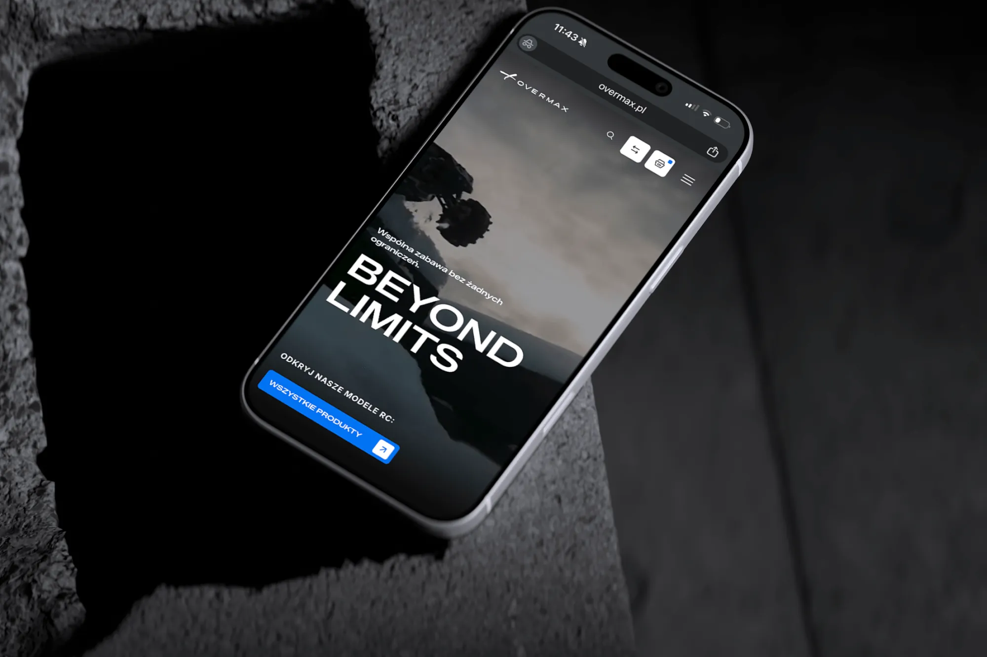
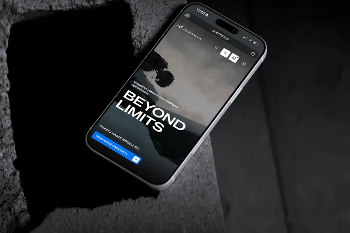
01 / 05 Overmax Product page on a phone See the project

01UX and UI

One letter apart

We write them together, with a slash, because one doesn't work without the other. The most convenient path loses to a button nobody noticed, and the prettiest button won't help if it leads nowhere.

UX

User experience, or how using the product feels

Everything a person goes through when using a product. Do they quickly find what they came for, do they understand what will happen when they click, and do they reach their goal without phoning your office?

Answers the questions

  • Who uses the product and what do they want to get done?
  • In what order do they make decisions?
  • What do they need to take the next step?

What comes out of it

  • User flows
  • Information architecture
  • Clickable wireframe
UX in the glossary

UI

User interface, or everything on the screen

Everything you see on screen and touch: buttons, fields, colours, typeface, icons, spacing and motion. A good interface shows straight away what matters most, what can be clicked and whose product it is.

Answers the questions

  • What will I look at first?
  • What can I click here, and what happens then?
  • Does it look like your brand?

What comes out of it

  • Desktop and mobile views
  • Design system
  • Description of motion and states
UI in the glossary
Good UX means people can. Good UI means they want to.

02From UX to UI

How a customer's question becomes a button

Take a product page in a lamp shop. Before anyone buys, they ask themselves five questions. UX decides where and in what order they find the answers, and UI gives those answers their form.

Project stage

Questions first

Before we draw anything, we collect the questions customers ask themselves before buying and put them in the order they come to mind.

Then the wireframe

Each question gets its own place on the screen. There are no colours yet, and that's deliberate, because at this stage the only topic is whether someone can buy a lamp here.

The interface last

The same places get the brand colours, typeface, photos and motion. The most important button stands out from a distance, and nothing else gets in its way.

Lighting above a table

Dome pendant lamp

Shade colour
Ø 40 cm
shade diameter
60–150 cm
adjustable drop

PLN 649

Ships tomorrow

Ask about this lamp
  1. “Is this the right lamp?”

    UX decides

    Photo and name right at the top. Customers first check that they've come to the right place.

    UI shows

    A large photo on a light background and the name in the brand typeface. More photos with a swipe.

  2. “Does it come in my colour?”

    UX decides

    Colours just below the name, because they decide whether the customer reads on.

    UI shows

    Swatches in circles, the selected one outlined. The shade in the photo changes colour with the choice.

  3. “Will it fit above the table?”

    UX decides

    The dimensions customers check with a tape measure in hand: shade diameter and drop length.

    UI shows

    A small dimension drawing, legible without zooming in.

  4. “How much is it, and when will it arrive?”

    UX decides

    Price and delivery side by side, because customers decide on both at once.

    UI shows

    The price in the largest type size, with the delivery date next to it and an icon.

  5. “How do I order it?”

    UX decides

    One main button within thumb's reach. A question to the shop as a second, quieter option.

    UI shows

    A button in the accent colour near the bottom edge. Tapping it confirms that the lamp is in the basket.

In practice

That's how we started the Overmax shop. Most customers browse it on their phones, and the model page matters most to them, so we built the concept on the mobile page for the X-Hooligan and only then the rest of the shop on top of it.

See the Overmax project
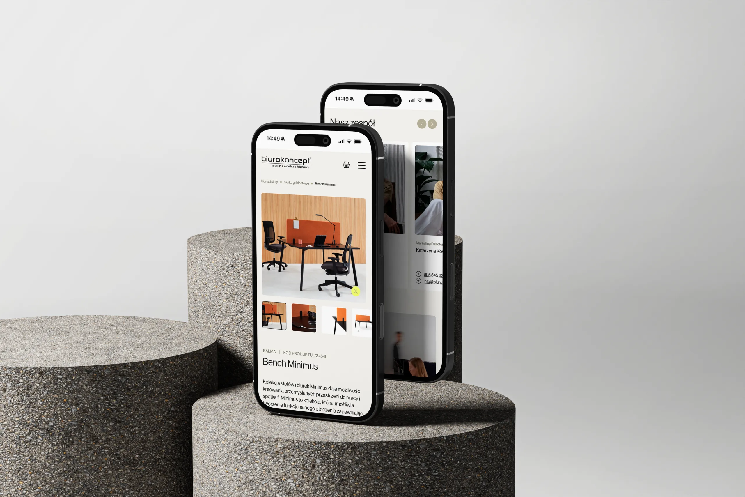
The mobile version of biurokoncept.pl on two phones, with a product page in front
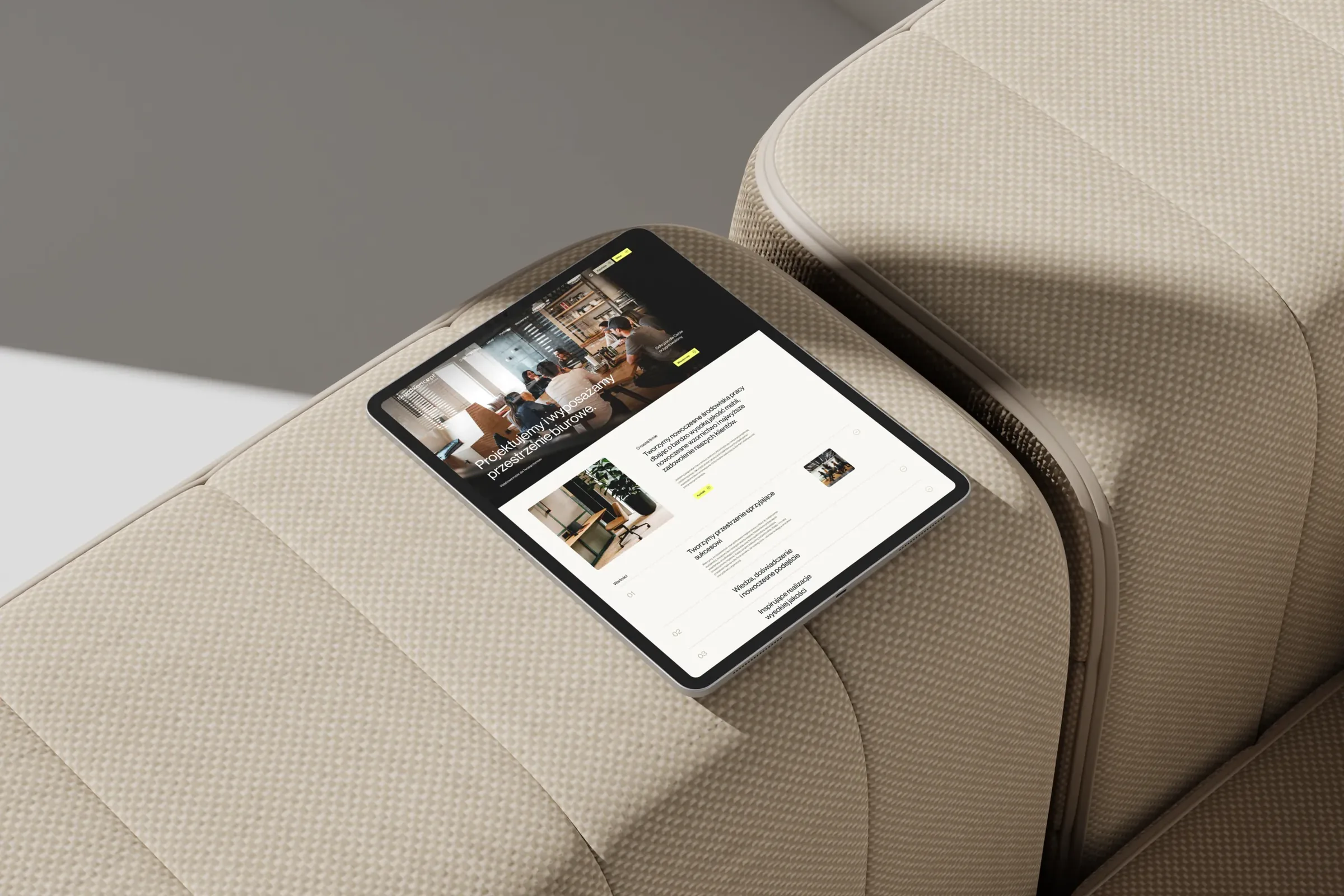
Biurokoncept: a catalogue of over a thousand pieces of office furniture, with a separately designed mobile version

03Approach

How do we make an interface obvious?

Obvious to the customer who sees it for the first time, and to the developer who will build it.

  1. Conversations

    We listen to the people who will use the product, and to those who take their calls today. Customer service knows more about an interface than many a report.

  2. Paths

    We map out where people come from, what they want to get done and where they give up today. Every screen gets its place along that path.

  3. Order

    We arrange content and features in the order people make decisions. In the Biurokoncept shop, three routes lead to the range: by spaces, products and services.

  4. Wireframe

    Grey rectangles with real content come first. A wireframe is the cheapest place to move a button, add a step or cut a feature nobody needs.

  5. The brand on screen

    When a brand promises something, the interface has to keep that promise. We take the colours, typeface, icons and tone of messages from the brand and test them on screen. In the dark Overmax shop the main blue turned out to be too dark, so we used a lighter one from the car range.

  6. Words

    We write buttons, messages and hints, in other words UX writing. “Send enquiry” says more than “Next”, and a good error message tells you how to fix the problem.

  7. Accessibility

    We check contrast, text size, keyboard navigation and screen reader descriptions in every project. Interfaces are also used by people with weaker eyesight, in full sunlight and on the move.

  8. Handover

    Developers get desktop and mobile views, states, motion and a component library. During the build we answer their questions, and when needed, we write the code ourselves.

Our goal is interfaces that, once launched, things get quieter in customer service.

04What we design

What should your interface get done?

Each of these interfaces has a different job to do, so we design each one a little differently.

Online shop Product page, basket and everything in between

What we do

We design shops from the product page up: photos, variants, filters, comparisons, basket and checkout. We also cover what's specific to your business, for example products that can't be sold online.

What you get

  • Product page in its variants
  • Listings, filters and comparison tool
  • Basket and checkout flow
  • Desktop and mobile views
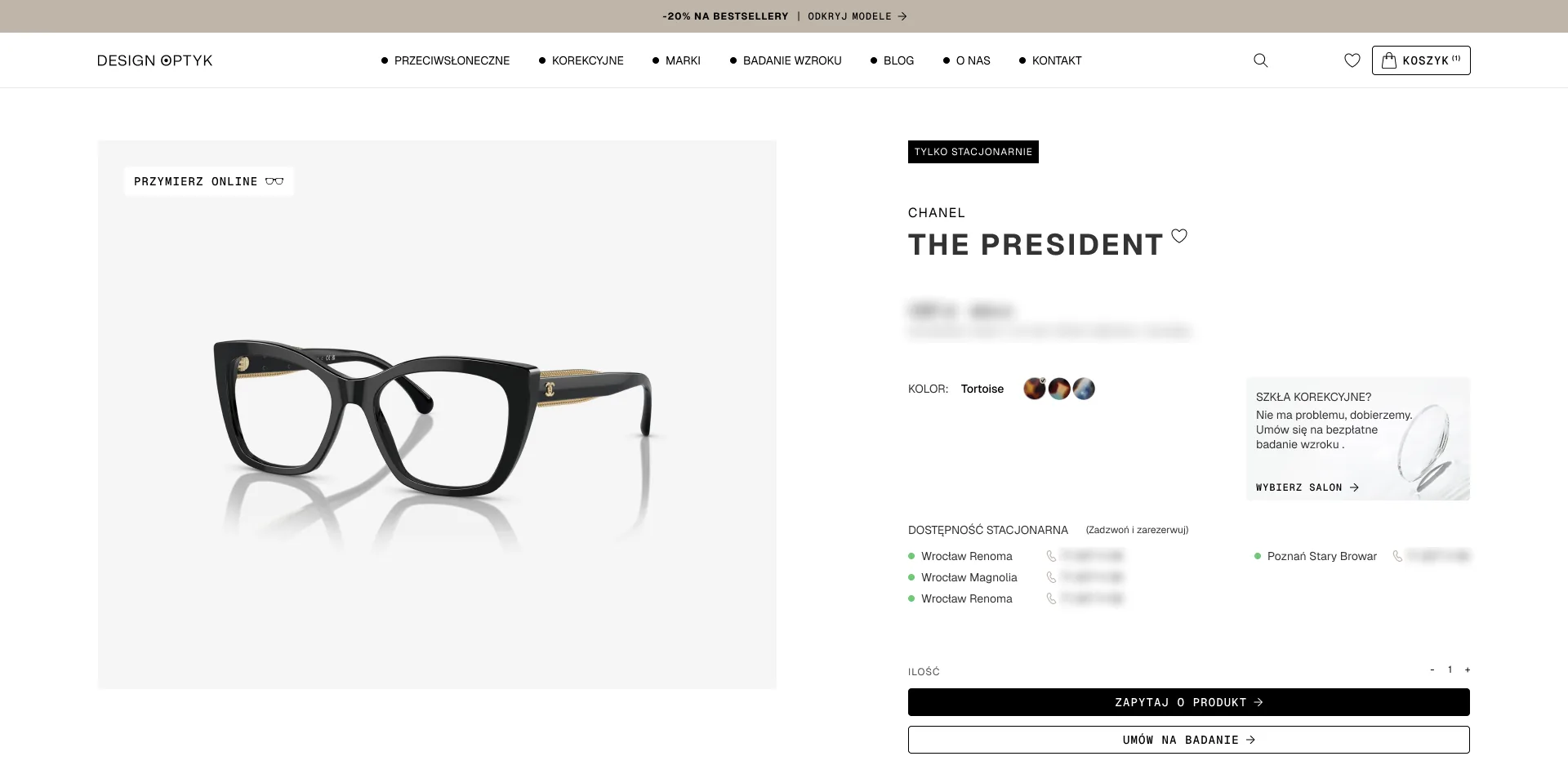
Design Optyk An online shop linked to the stores: for brands that can't be sold online, the basket becomes “Ask about this product” More about online shops

Similar projects

Partner portal Partners take what they need themselves

What we do

We design portals where partners and resellers download materials, photos and presentations themselves. We start from the requests that reach you by email today and turn them into a menu.

What you get

  • Materials sorted into categories
  • Search and filters
  • Downloading many files at once
  • An admin panel for adding materials
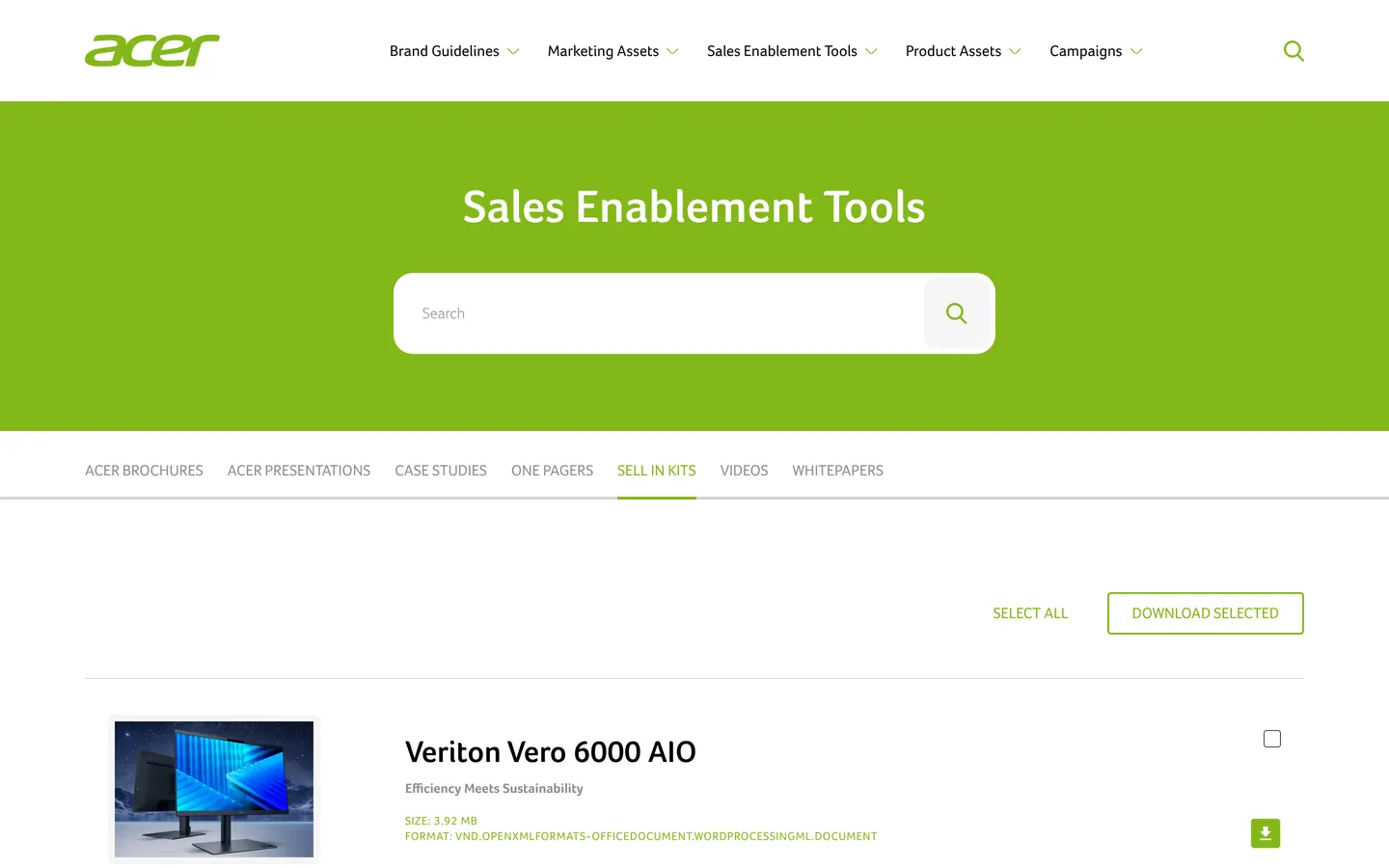
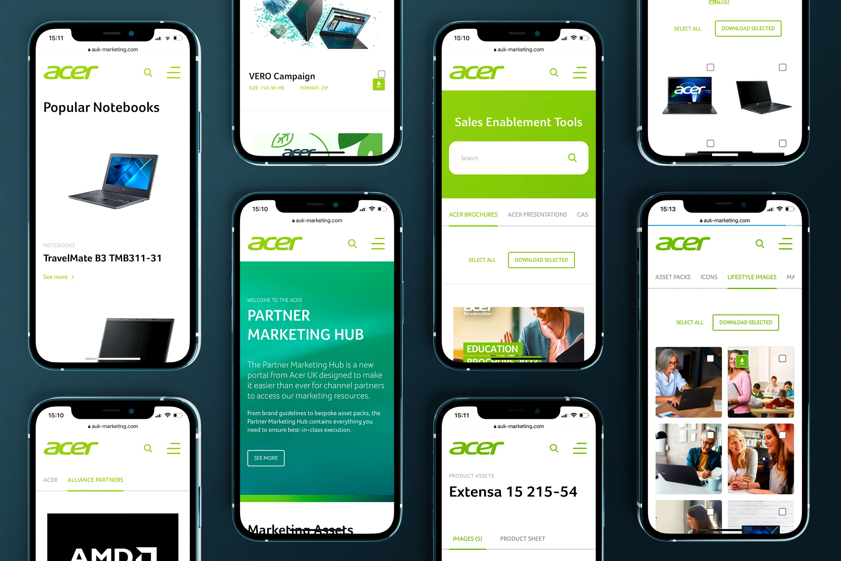
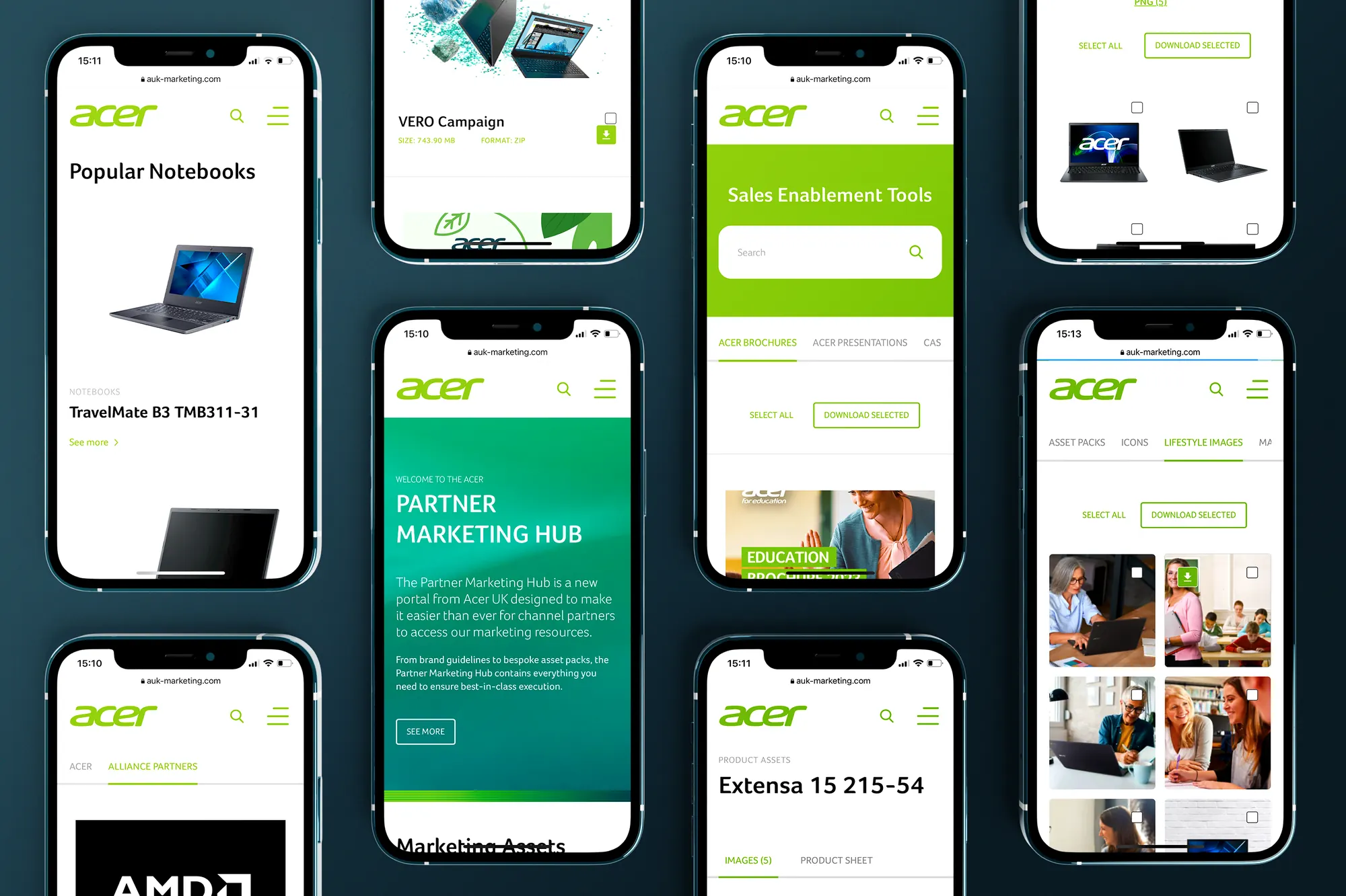
Acer UK Partner Marketing Hub: partners download brand materials themselves that someone used to send them by hand
Product configurator Customers build the product and see the result straight away

What we do

We break the product down into steps customers understand without a catalogue in hand, and show the result after every choice. At the end there's a basket or an enquiry with the full configuration, so the sales rep doesn't start the conversation from scratch.

What you get

  • Steps and choice logic
  • A preview that changes with each choice
  • Hints next to the options
  • A basket or an enquiry with the configuration
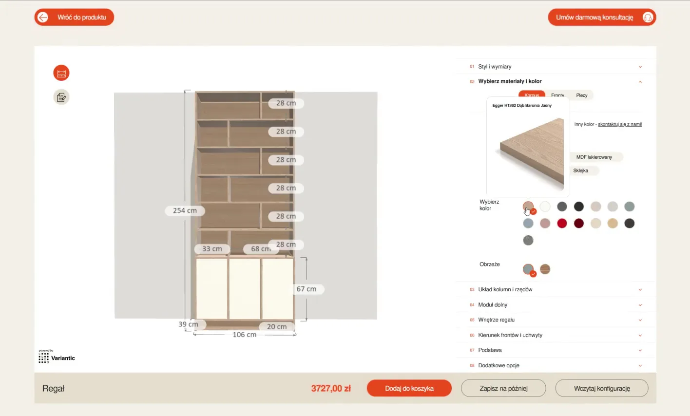
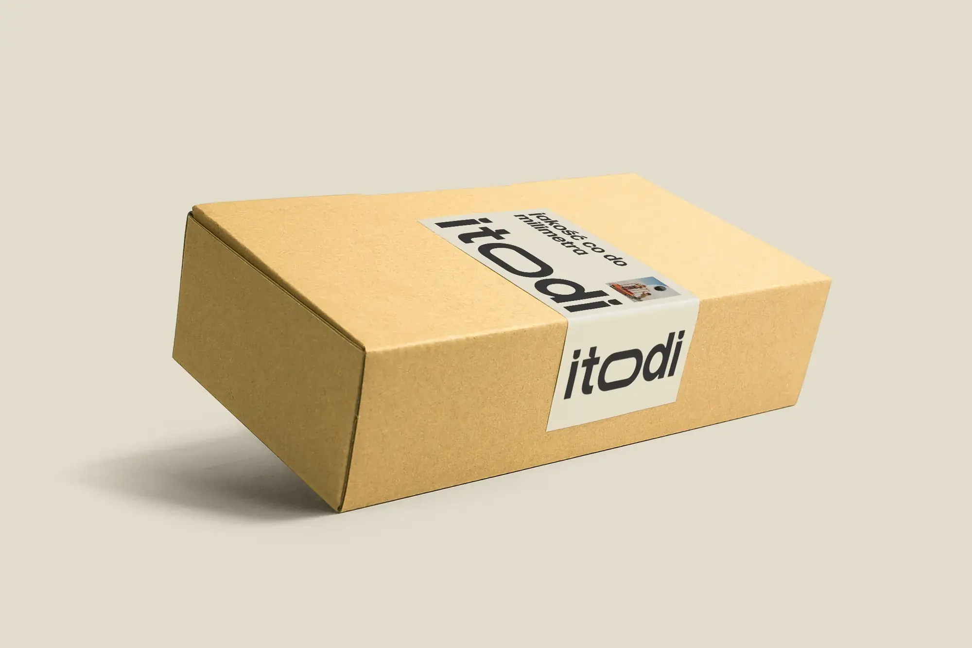
Itodi Made-to-measure furniture in a few steps: width, height, fronts, base and colour More about websites with a configurator

Similar projects

A website for specialists Specifications, drawings and know-how for architects

What we do

Architects come for something specific: a parameter, a drawing, a file for their project. We organise the website around the requirements they start from, and give them everything in a few clicks, in their own language.

What you get

  • Specification tables and filters
  • A knowledge base with articles
  • Downloadable files
  • Language versions
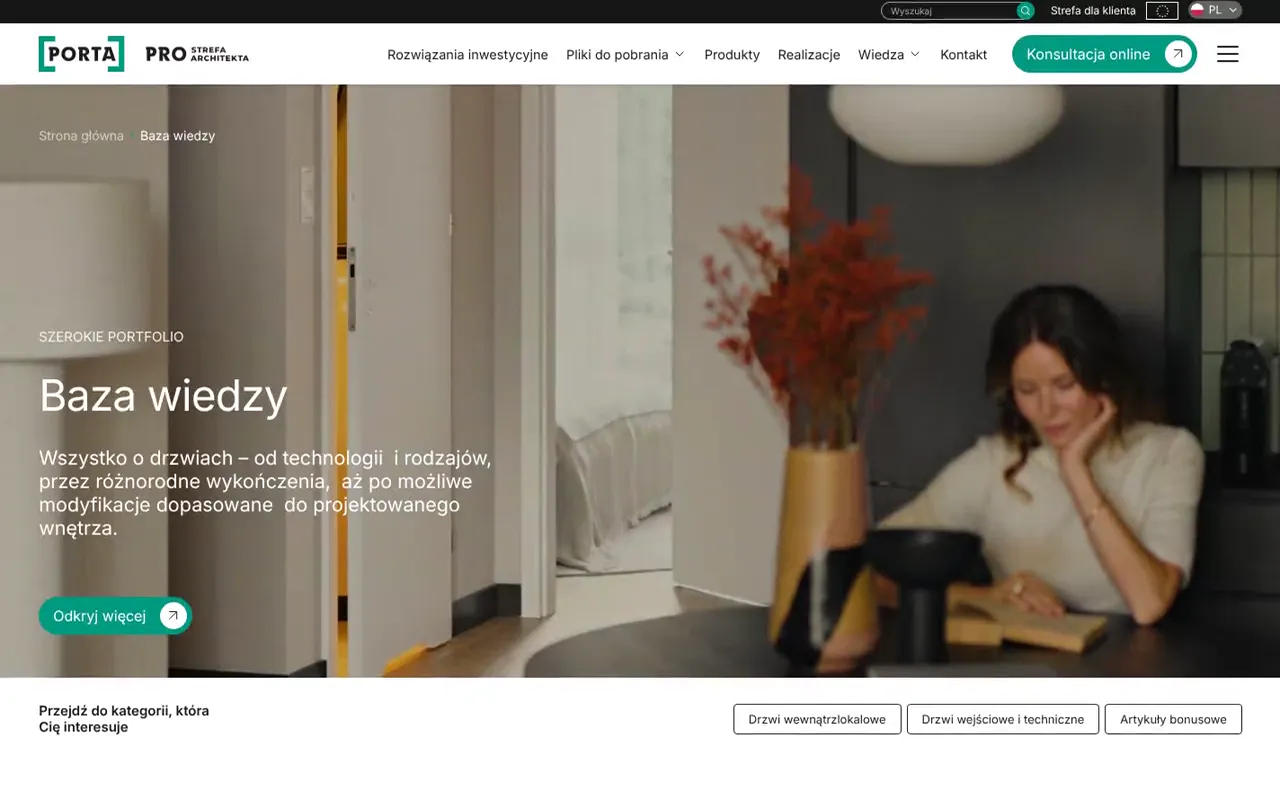
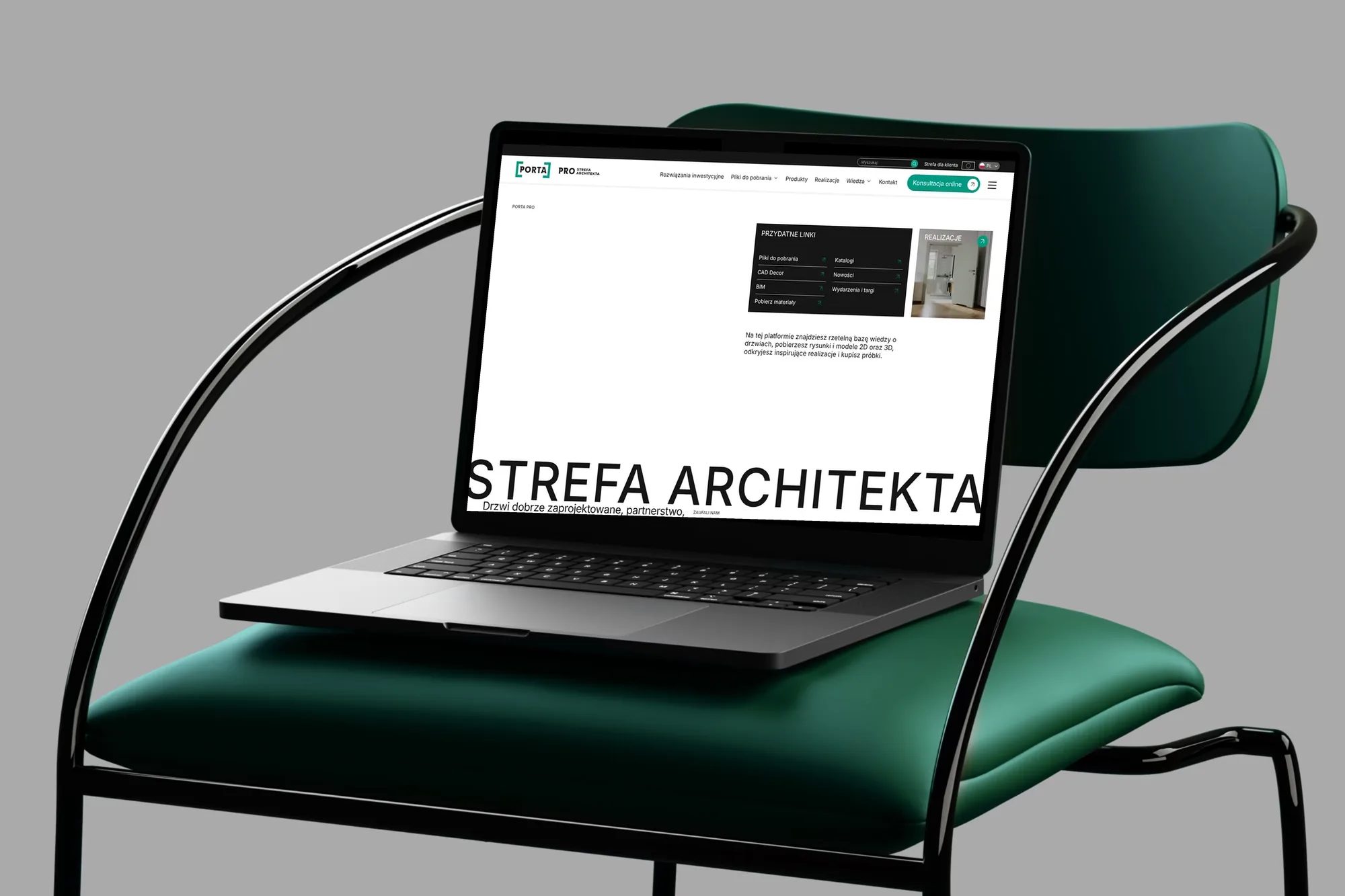
Porta Architect Zone: doors by specification, a knowledge base and downloadable files in Polish and Romanian
Web app and customer portal A tool someone works in every day

What we do

Customer portals, tools for departments and apps for everyday work. We design what users do most often first, because that has to be the fastest. Less frequent features can wait one level down.

More about web apps

What you get

  • A map of roles and tasks
  • Tables, forms and messages
  • Views with micro-interactions
  • A design system for future features
A system for multiple websites Shared elements for several sites, companies and countries

What we do

When a company runs several websites, in several countries or for several subsidiaries, we design one system: a shared framework, components and rules. Each website gets its own accent, and new ones come together faster, because nobody starts from scratch.

What you get

  • Component library
  • Usage rules and variants
  • Versions for companies and countries
  • Documentation for the teams
Grupa BEST One system for six websites of the group's companies in five countries How we work with a design system
Acer UK Partner Marketing Hub on eight phone screens: home page, products, sales materials and lifestyle photos
Acer UK: a Partner Marketing Hub where partners download brand materials themselves

05Process

From first conversation to developer files

We work in stages, to a schedule you know before we start. After each stage we show what we've made and say what comes next, so you always know what we're doing, why and when. On smaller projects we combine some stages, but the order stays the same.

  1. Etap 1: Workshops and interviews

    We get to know your customers inside out: who they are, what they want to get done and where they get lost today. We talk to you, to customer service and, whenever possible, to the users themselves.

    What you get

    • A list of users and their tasks
    • Goals we come back to with every decision
  2. Etap 2: Information architecture

    We work out what's in the product, what belongs together and how to move between it all. This is where the most important decisions are made, so we don't take shortcuts.

    What you get

    • A map of views
    • Flows for the key tasks
  3. Etap 3: Functional wireframe

    A clickable wireframe of the key flows, with real content and no colours. We go through it with you screen by screen until everything is in its place.

    What you get

    • Clickable wireframe
    • A list of content to prepare
  4. Etap 4: Visual concept

    We show the direction on one key view, often on a phone. Once that screen works, the rest has something to build on.

    What you get

    • Design of the key view
    • Colours, typefaces and icon style
  5. Etap 5: Views, states and system

    We design every view for desktop and mobile, together with the states that are easy to forget: an empty list, an error, a product that's unavailable. The recurring elements become a component library.

    What you get

    • Desktop and mobile views
    • A design system with states
  6. Etap 6: Handover and build

    We hand over the files with a description of how elements behave, the motion and the graphics. During the build we answer developers' questions and check that the finished product looks like the design.

    What you get

    • Specification and files for the build
    • A review of the finished build

06Design system

One button, eight states

In a presentation a button has one look. In the finished product it has to know what to do when someone hovers over it, reaches it with the keyboard or clicks it while the server isn't responding. We design each of these states once, in the component library, and every screen takes it from the same place.

Button state

01How it looks before anyone touches it.

02It lifts slightly, to show it can be clicked.

03A clear outline for people who navigate the page with a keyboard.

04It gives under the finger, so it's clear the click registered.

05It shows something is happening and ignores a second click.

06It confirms it worked, then returns to its default state after a moment.

07It says what went wrong and what to do next.

08It looks switched off and hints at what's missing.

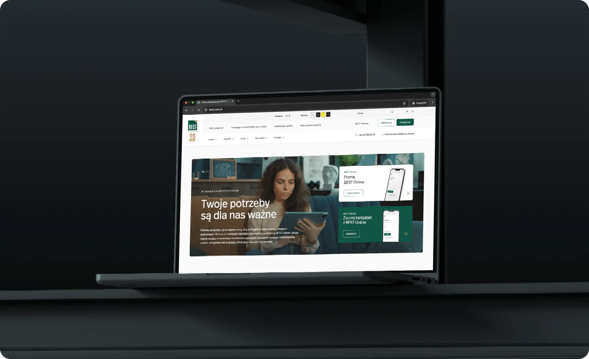
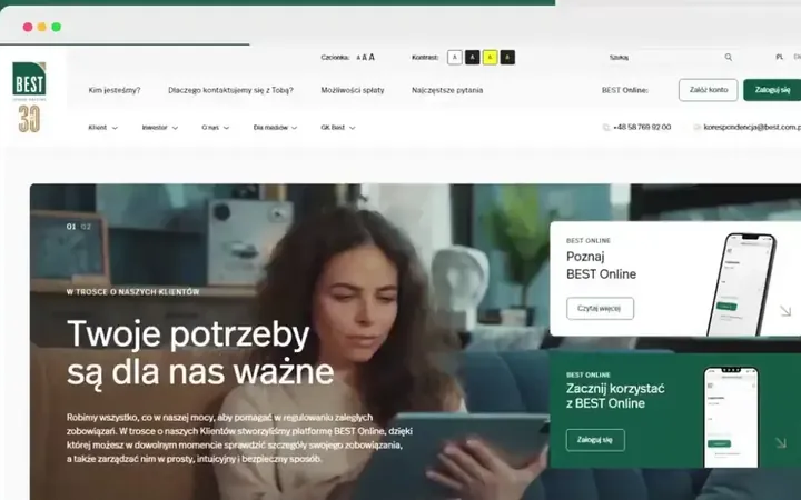
A laptop on a dark background showing the best.com.pl home page with the line “Your needs matter to us”.
Grupa BEST: best.com.pl, the first website and the source of the system for the group's companies

07Questions

Frequently asked questions

What's the difference between UX design and UI design?

UX decides what's on the screen, in what order and what happens after a click. UI decides how it looks and behaves. The first starts with interviews and wireframes, the second ends with colours, typefaces and motion. There's more at the top of this page.

Can you design just the UI for our wireframe?

Yes. We then start by going through the wireframe with you, to understand the decisions already made. If something in a flow worries us, we'll say so before we start drawing.

Do you also work on an existing shop or app?

Yes, and that's often where we start. We check what works and what gets in the way, and improve it in stages, so customers can keep using the product the whole time. We moved the Biurokoncept shop from its old platform together with its products, and every old product address now leads to the new one.

What software do you design in?

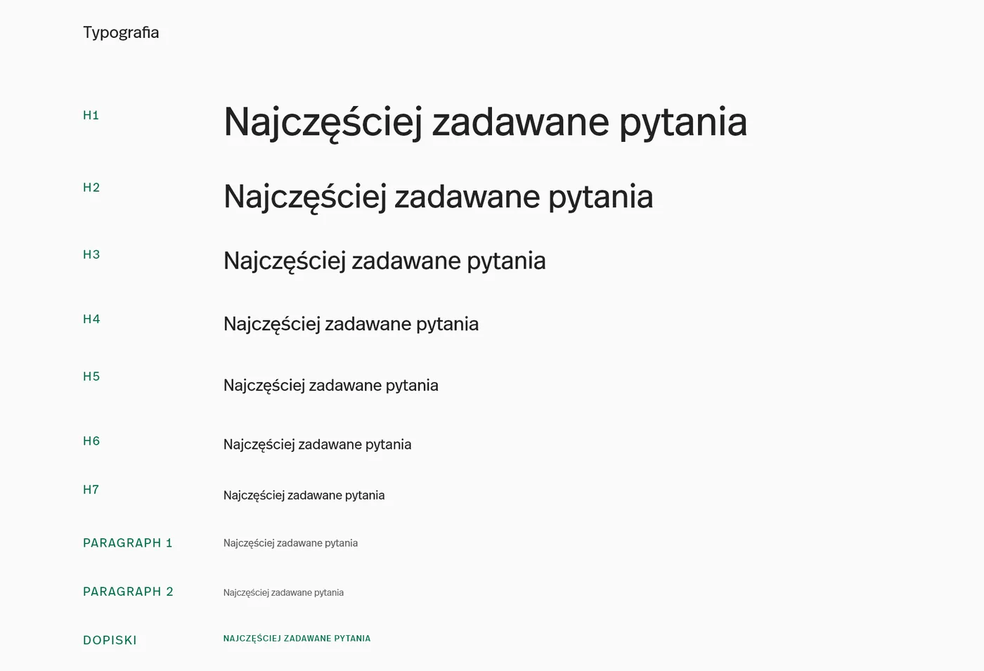
Figma. You get a file with views, components and styles that your team can keep working in. We export icons and graphics in formats ready for the build.

Do you write the code too?

Yes. We build WordPress and WooCommerce websites and shops ourselves, like the Porta Architect Zone and the Biurokoncept shop. We can also hand the design over to your developers, as with the Overmax shop, and answer their questions during the build.

Will the design meet WCAG?

We check contrast, text size, keyboard order and screen reader descriptions in every project. When a website has to meet WCAG, we agree on the level at the start. That's how best.com.pl was made, built to WCAG 2.0.

What's it like working with you?

Before we start, you know how the work will be organised, in which stages and what you'll get at the end. Then we stick to the schedule and show what we've made after each stage. If something needs your decision, we say so right away and suggest what we'd choose ourselves.

What do we get at the end?

A Figma file with desktop and mobile views, a component library with states, a clickable prototype, a description of motion and element behaviour, and graphics for the build. If we build it ourselves, also a working website and training on the admin panel. Everything stays with you, so your team can take over part of the work, and we can come back together to extend it at any time.

Projects with this service

View

From the glossary

All terms

Get in touch

Fill in the form or email us at:

hello@fluostudio.pl

Prefer to call?

+48 726 220 596

arrow form contact

"*" indicates required fields

This field is used for validation and should be left unchanged.

Cookies

With your consent, we use Google Analytics and Hotjar to see how people use the site, and Google Ads to measure how well our ads work. Without consent, the site works just the same. You can change your choice at any time under “Cookie settings” in the footer. Details are in our privacy policy.

Cookie settings

Necessary Always on

The fluo_zgoda cookie remembers this choice for 12 months. Cloudflare Turnstile protects the forms from bots.

Plausible counts visits without cookies or personal data, so it works regardless of this choice.