




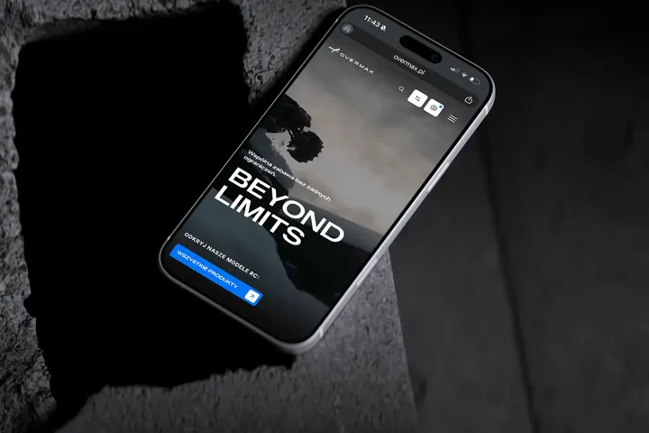
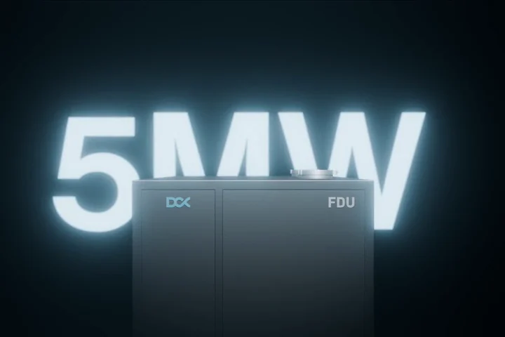
Brand key visual.
The logo is the signature. The key visual is the handwriting.
A brand is recognised by its colours, typeface, graphic motif, icons and photos, often before anyone notices the logo. We bring these elements together into a key visual, the system that makes a post, a catalogue and a trade fair stand look like the work of one company. We design key visuals for brands, products and events. The starting point is the logo, and the rules are set down in the brandbook.
01Approach
How we design a great key visual
A key visual is everything besides the logo that makes a brand recognisable: colours, typeface, graphic motif, icons, illustrations and photos. Every decision, from colour to typeface, comes with the reasoning behind it.
-
Direction first
We start with moodboards, two or three different directions, and your team picks one. Only the chosen direction is developed into a system.
-
Grows out of the logo
We derive the graphic motif from the shapes in the logo, so the brand shows even where the mark doesn't appear.
-
Every element has a job
We define what each colour is for, and when the pattern does the work and when an illustration does. We also set proportions, so new materials look like one brand.
-
Tested on real materials
We show the system on the most important materials: posts, a presentation, covers and the website. It has to work on screen and in print, large and small.
-
Readable for everyone
We check colour contrast against the WCAG guidelines, so text stays readable for people with weaker eyesight too.
-
Ready to use
You get a library of elements and templates, so your team can put together new materials on its own. The rules go into the brandbook.
-
Grows with the brand
We design the system to take on new products, companies and channels without rebuilding what already works.
02What it's made of
What goes into a key visual?
We usually design the whole system, but we can also add any single element to a brand that's already up and running.
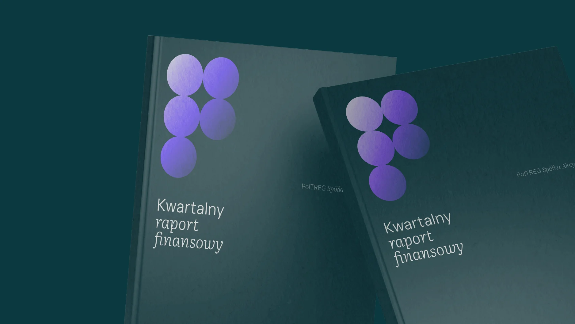
Graphic motif and pattern A pattern made from brand elements for backgrounds, covers, packaging and walls
What we do
We build a motif and a repeating pattern from a shape in the logo. It fills backgrounds, the backs of business cards, bags and covers, and makes the brand recognisable even without the logo.
What you get
- Graphic motif and its variants
- Pattern in several scales and colours
- Rules for use on backgrounds and photos
- Files for print and web
Similar projects
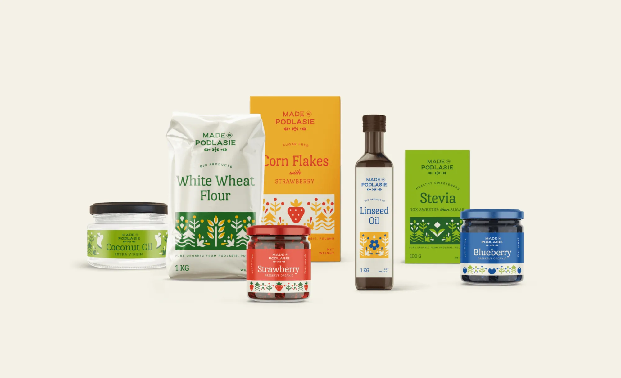
Colours and typography A palette with roles, and typefaces that also work in Word and PowerPoint
What we do
Every colour gets its own role, and when needed, colours tell product categories or companies apart. We choose typefaces, plus substitutes for office documents.
What you get
- Palette with CMYK, RGB, HEX and Pantone codes
- Colour roles and proportions
- Typefaces and their substitutes
- Tested text contrast
Similar projects
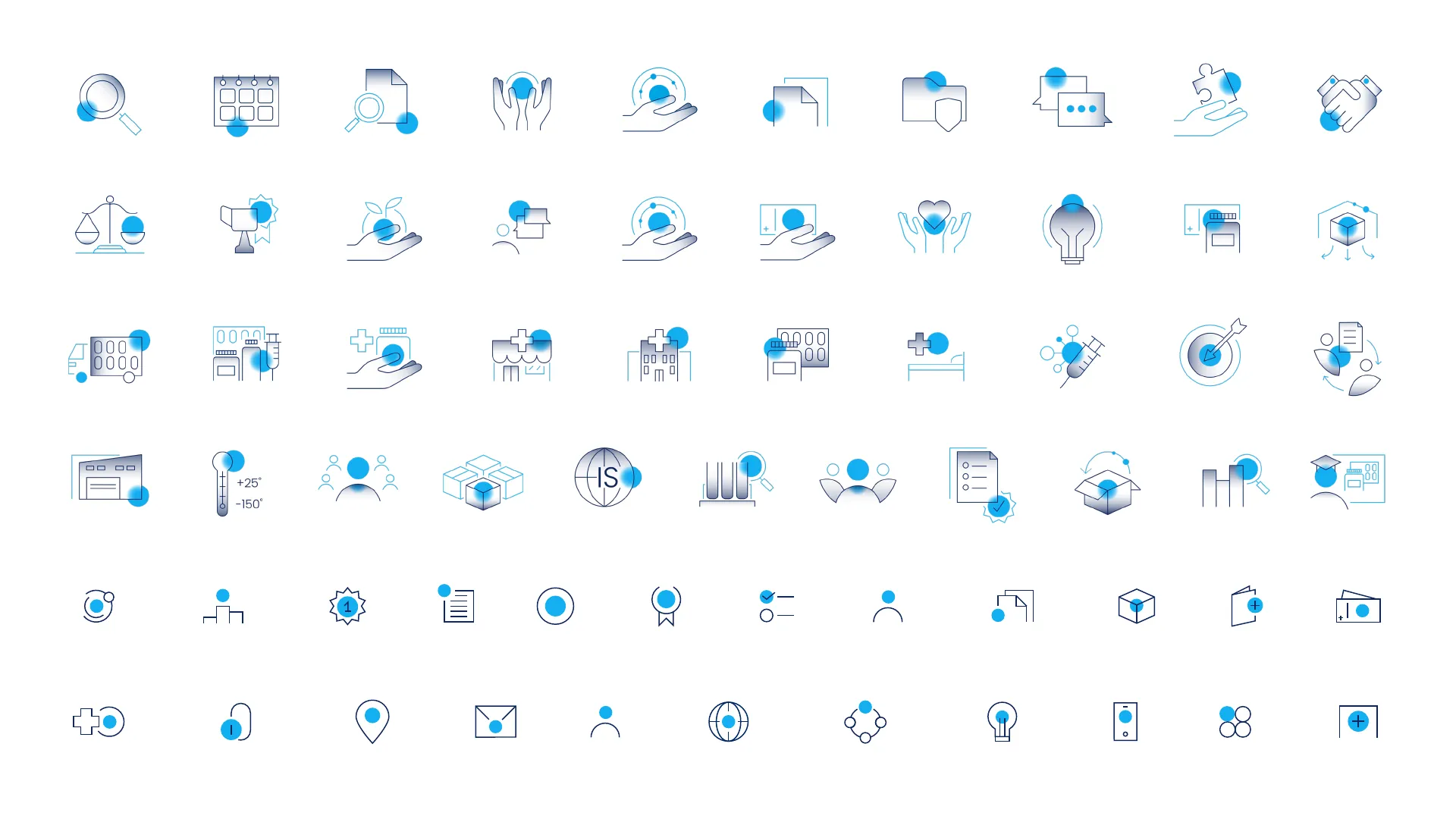
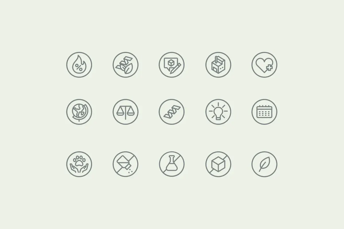
Icons A set in one style, matching the logo
What we do
We draw icons with the same line and to the same rules as the logo, for the website, catalogue, presentations and packaging. New icons are drawn on the same grid.
What you get
- A set of icons in one style
- Grid and rules for drawing new ones
- Print and screen versions
Similar projects
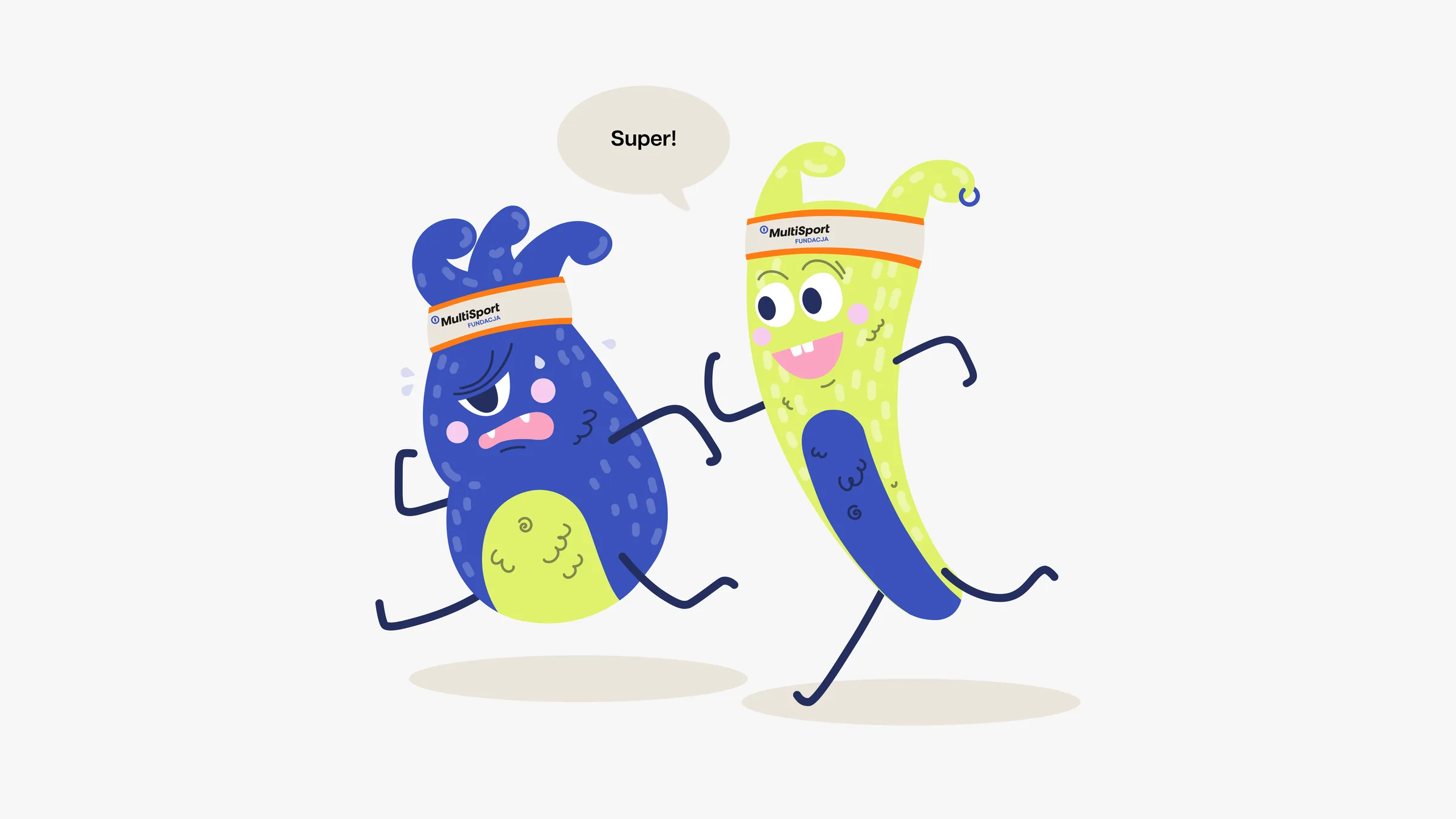
Illustrations and brand character Drawings that explain harder topics or give the brand personality
What we do
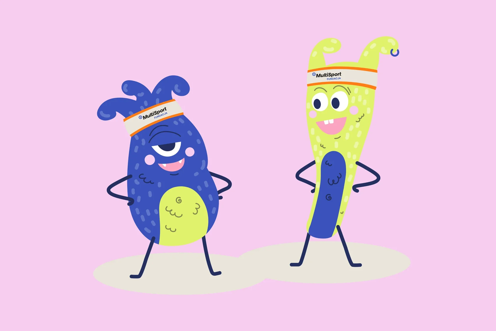
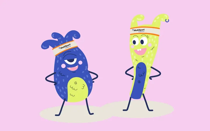
We design an illustration style and the illustrations themselves, to explain services or give packaging character. When a brand wants to sound less formal, we also design a character who appears in its communication.
What you get
- Illustration style and drawing rules
- Illustrations for materials and packaging
- Brand character in 2D or 3D
Similar projects
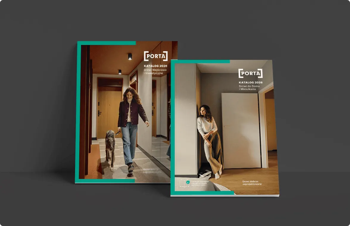
A system around an existing logo The logo stays, and we build the rest of the brand
What we do
When the logo stays as it is, we build the rest around it: colours, typography, icons, layouts and usage rules. Often the starting point is a single detail of the mark.
What you get
- Usage rules for the current logo
- Colours, typography and graphic motif
- Icons and material layouts
- Brandbook for the whole system
Similar projects
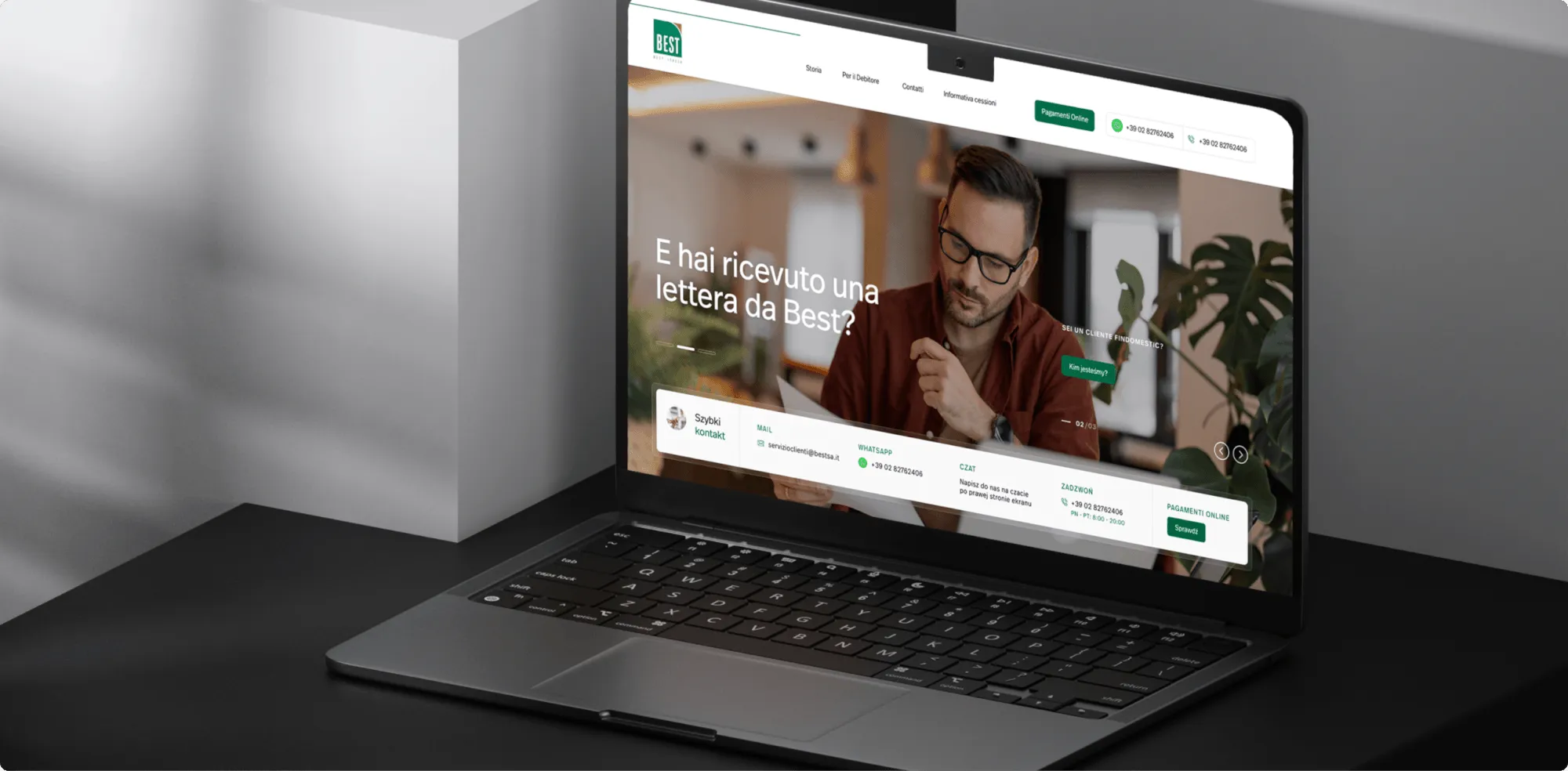
A system for a group of companies One brand and many companies or sub-brands, each with its own accent
What we do
We design one system for several companies or brands within a group. Each has its own accent, and together they clearly belong to one company. A new company gets a place in the system without it being rebuilt.
What you get
- Shared system for the whole group
- Accents and versions for each company
- Rules for adding more
- Brandbook for all companies
03Our motifs
You'll know them without a signature
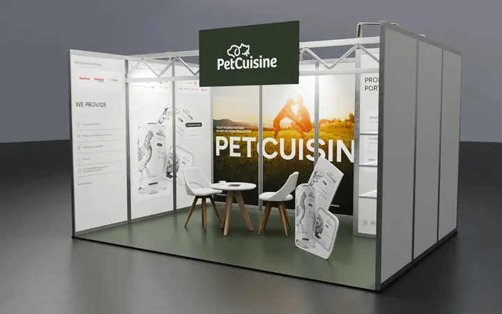
Most of them grew out of a detail in the logo: a dot, a letter, a bracket or a hexagon. They work on backgrounds, packaging, covers and stands, and make the brand recognisable from a distance.
-
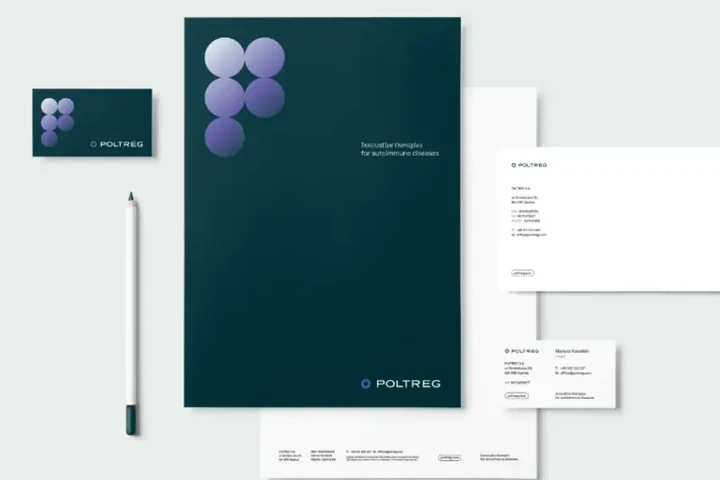
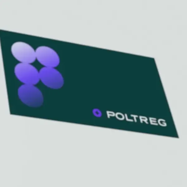 PolTREG
Circles that form a P
-
 Zippy Tail
Four category colours
-
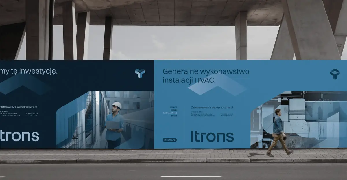
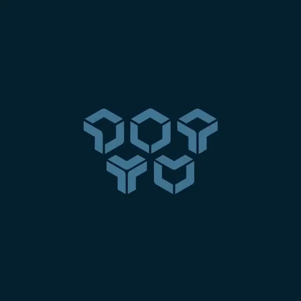 Itrons
Three modules that rotate
-
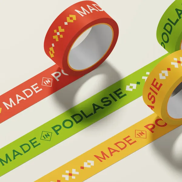 Made in Podlasie
An ornament from Podlasie embroidery
-
 irtech
A plus made of the letters r and t
-
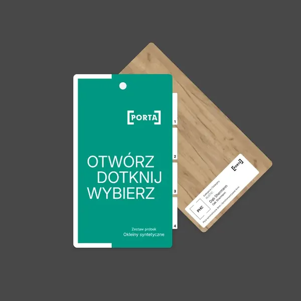 Porta
A frame of two brackets
-
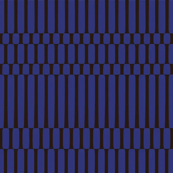 Mily Group
A forest from the letter I
-
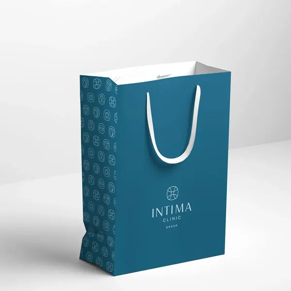 Intima Clinic
A pattern from the logotype
-
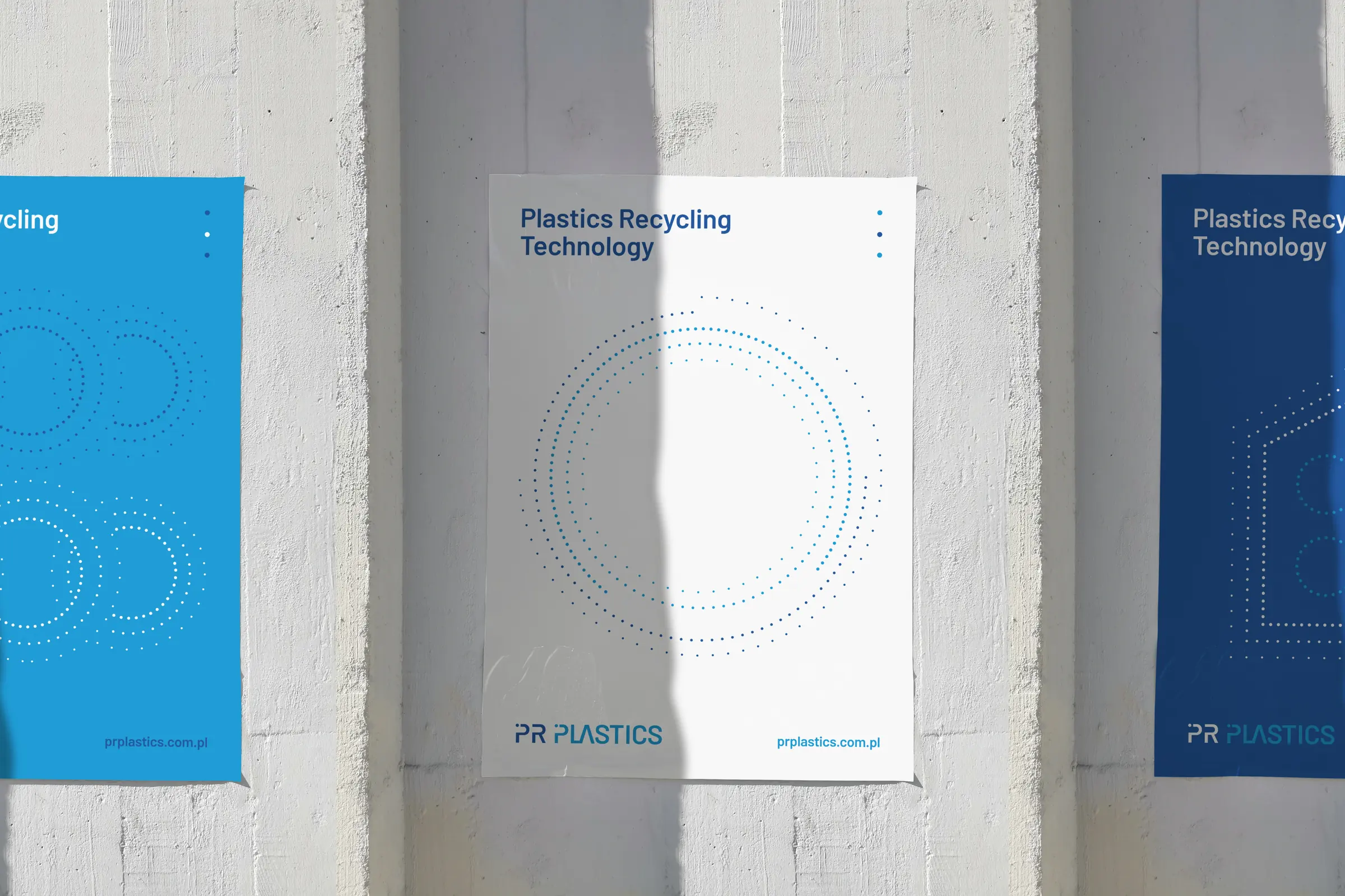
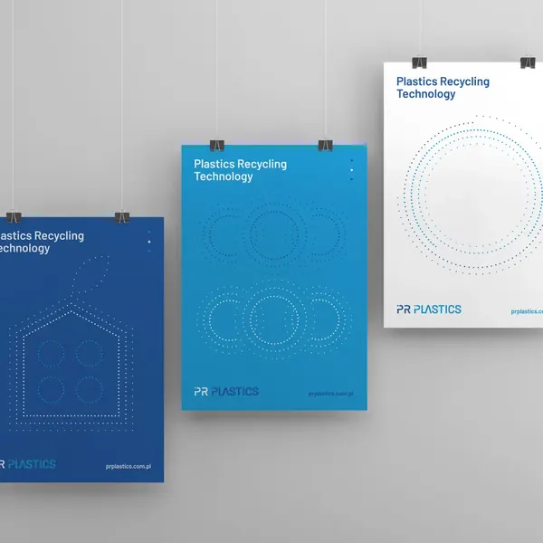 PR Plastics
The dot from the letter P
-
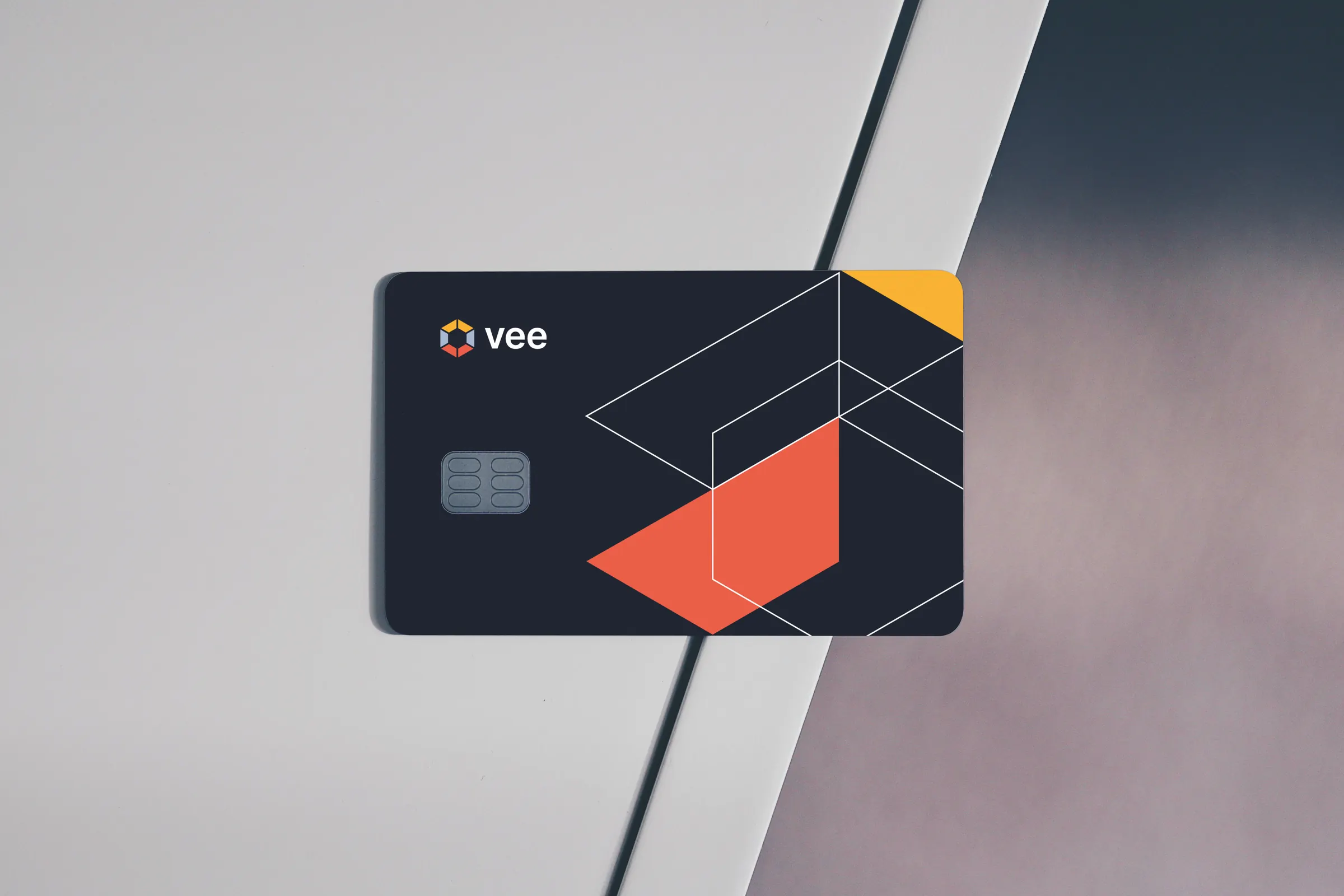
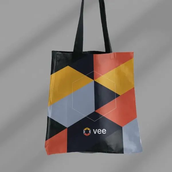 Vee
Shapes cut from the hexagon
-
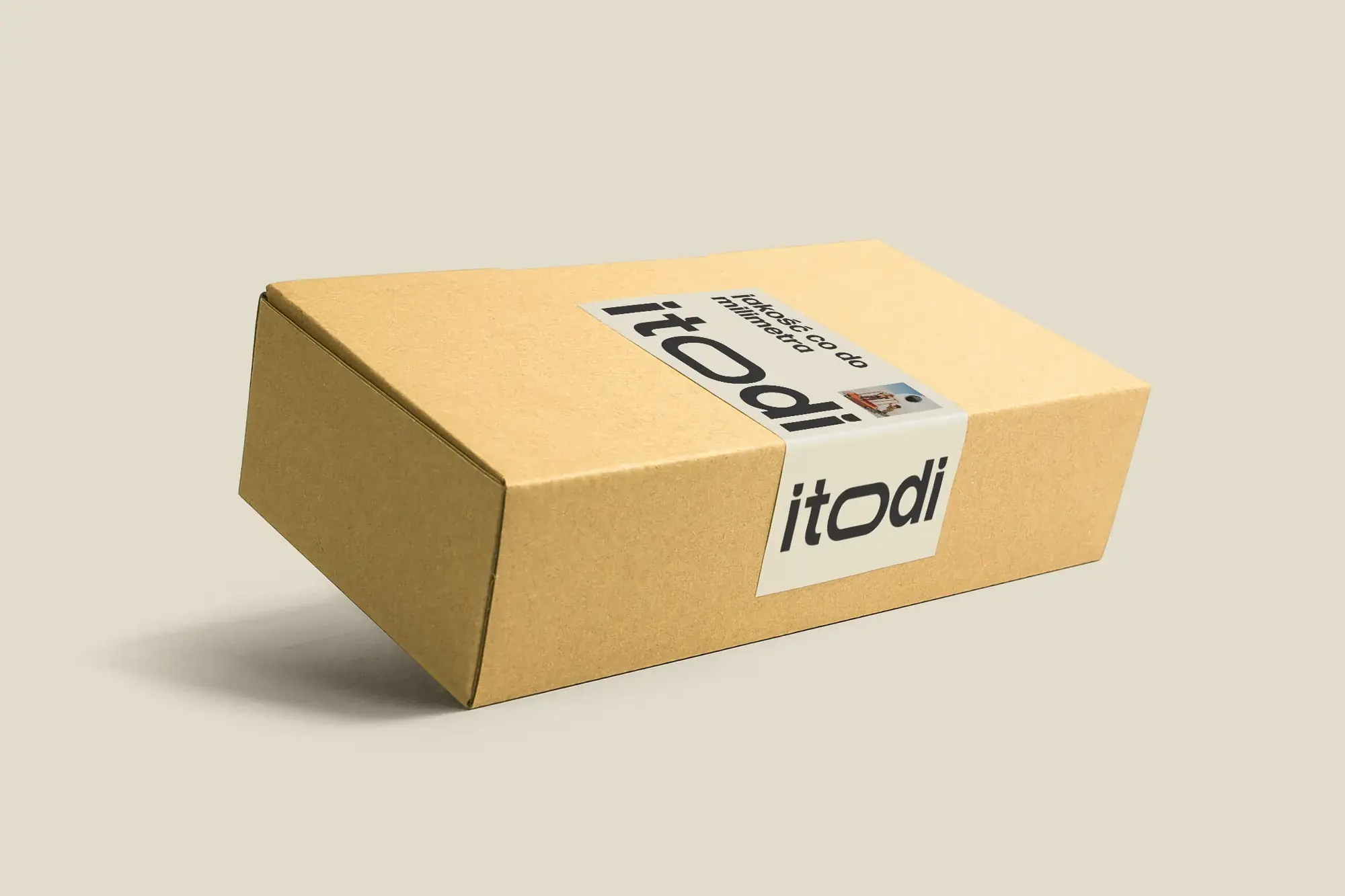
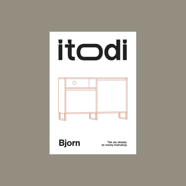 Itodi
The red line from the instructions
-
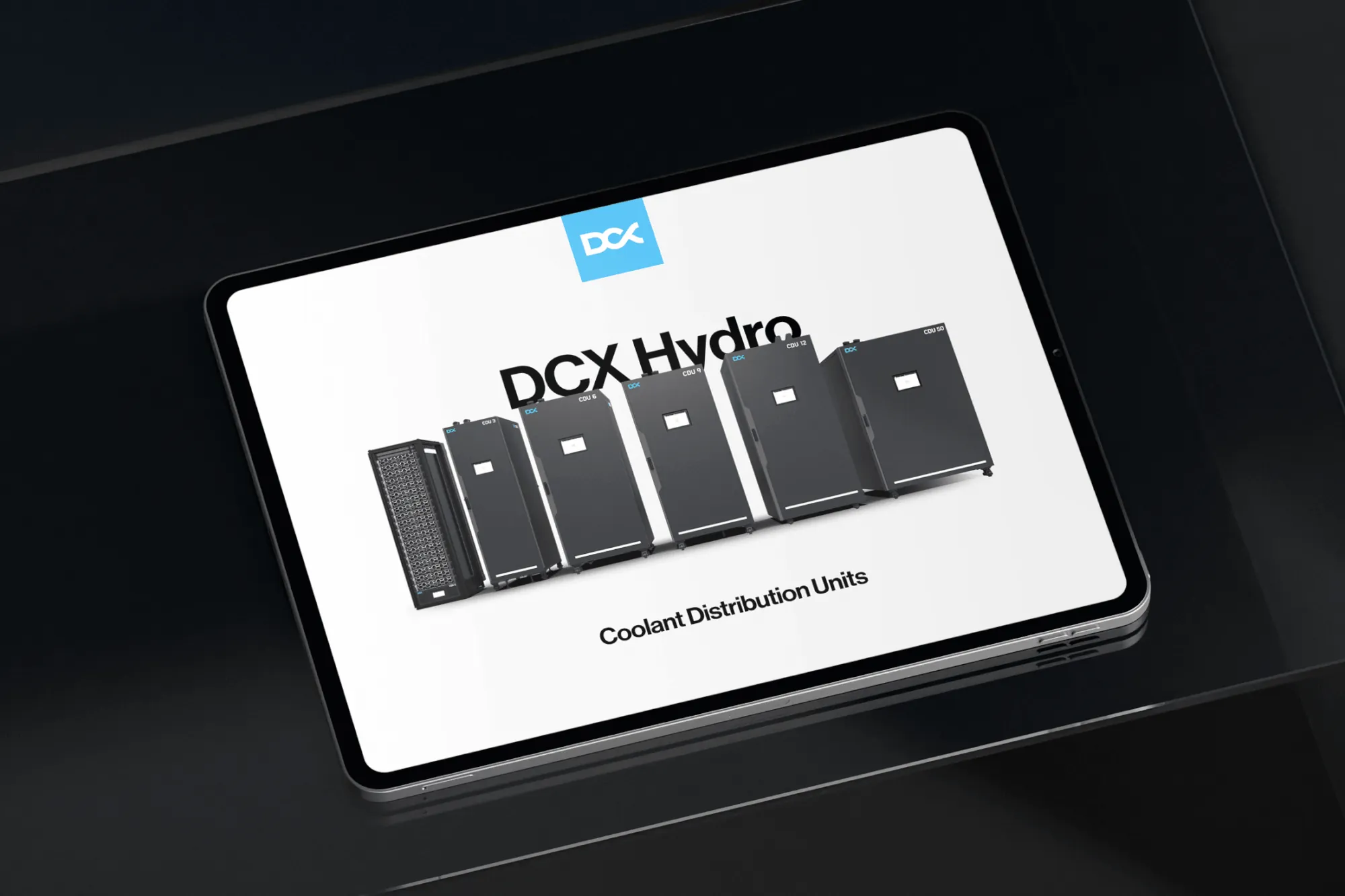
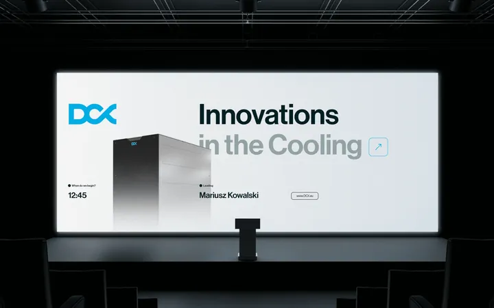
 DCX
Black, grey and a single blue
04The key in action
Dotting the i
Urtica's logo stayed as it was, and the whole key visual grew out of the dot over the “i”. In the logo the dot is a person: a patient, a pharmacist, a doctor or a customer. In the system it took on six jobs: it's the centre of every icon, a gradient sphere on navy backgrounds, a split pill between the hospital and the manufacturer and a circle with an arrow next to a button, and it also rounds the corners of photos and leaves a trail in animations.
The film walks through the materials that grew out of it: from the system's rules, through infographics and the stand, to icons, the presentation and the brochure.
Film chapters
05What you get
A full set of keys to your brand
You get a library of elements and rules on when to use which: colours with their codes, typefaces, motifs, icons and model layouts. Every new piece starts from ready-made elements.
-
Brand graphic elements
A colour palette, patterns, textures and motifs designed as one family. Each element fits the others, so they're hard to combine badly.
-
Composition rules
Proportions, margins, hierarchy, and how the system works in portrait, landscape and square formats.
-
Graphic library
Icons, graphics and patterns in organised files, in print and screen versions, ready to pick up and use.
-
Sample applications
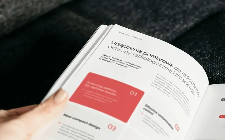
Model layouts for posts, print, presentations and the website. They show the system in action and give anyone making the next piece a head start.
-
Rollout guide
Technical specifications, source files and usage rules for the system, plus templates in the software your team uses.